FinTech · B2B · Employee Experience
Employees Knew Their
Numbers Existed.
They Still Avoided Them.
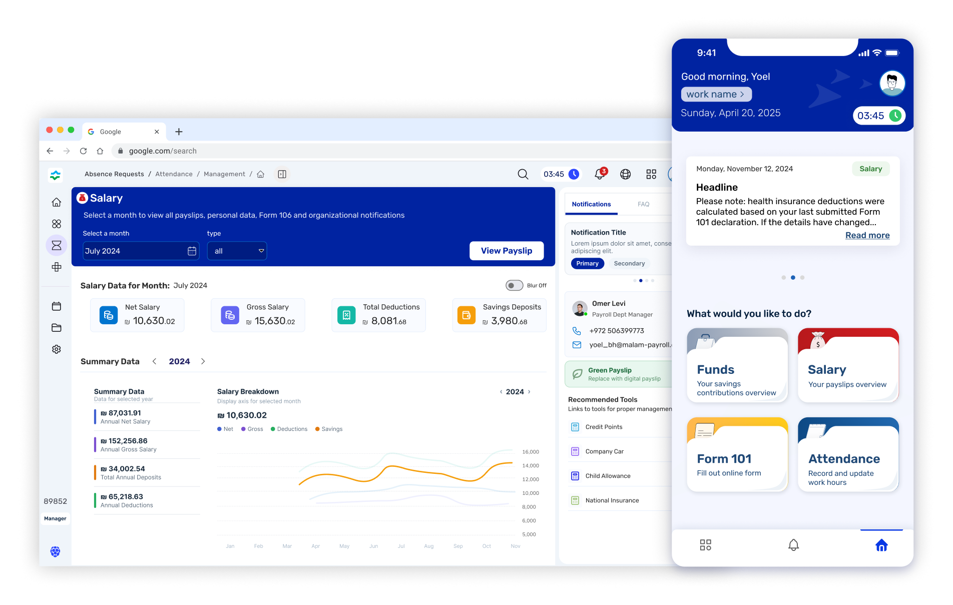
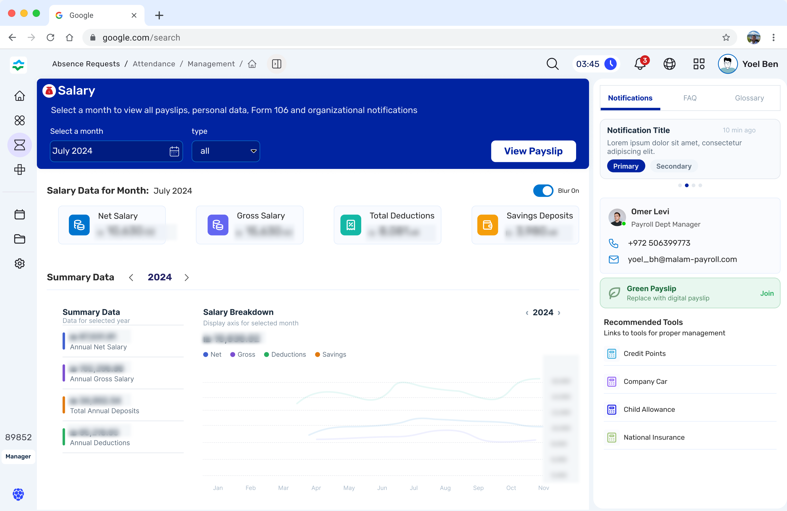
A B2B FinTech portal redesigned around one insight: people disengage from financial tools not because they don't care — but because the information feels threatening. Every decision in this project traces back to that.